Animated map of U.S. nuclear generating capacity
See the interactive map on bl.ocks.org (click on “Open” to see the full map).
The Python notebook, data files, and plot files are available in this Github repository.
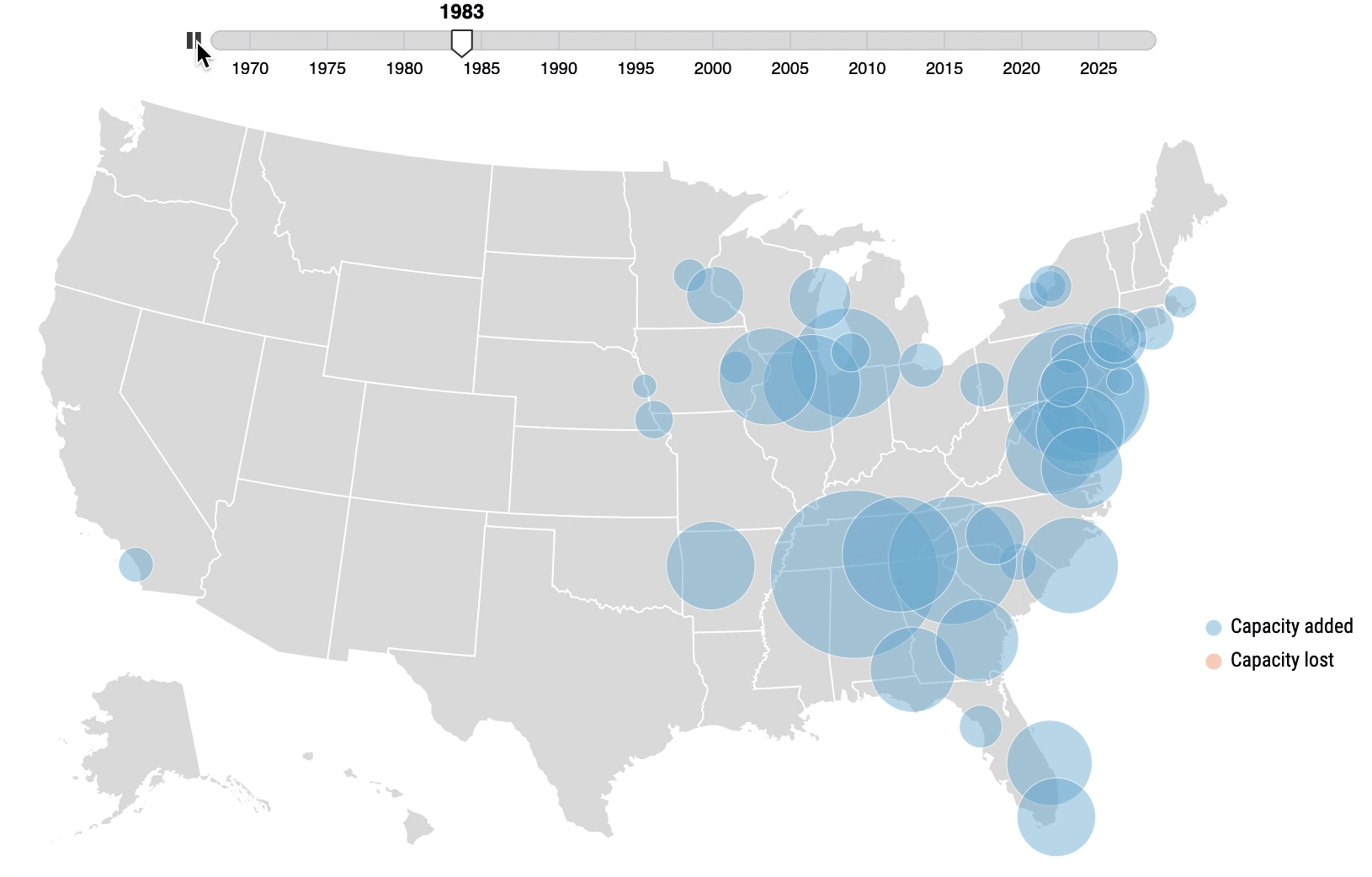
The above map was my first venture into the world of D3.js, over a year ago. It was inspired by an animated map of US job gains and losses posted on the consulting firm TIP STRATEGIES’s webpage. The map was created by a company called AxisMaps, and the AxisMaps blogged about the map’s creation itself a little bit here. I really loved the map a lot and wanted to recreate something similar but more in the context of my research. Retrospectively, it was a biiiiiiiit too complex to take on as a first project, but oh well. It’s been completed for a while now, but I never had the chance to publish it, so I thought I’d dedicate a blog post to going over my process/struggles in making the map.
Analyzing the data
Getting the data
All data used to make this figure came from the Energy Information Administration (EIA), specifically the Form 860 dataset. The right side of the webpage has each year’s dataset available to download as a .zip file. I used the 2018 release of the dataset, which was the most recent version available at the time of posting. I’ve uploaded the relevant Excel spreadsheets in the Github repo (in the “data” folder), so you don’t have to go out and download the data if you don’t want to. But if you do want to download it for yourself, upon extracing/unzipping it, you’ll see a number of Excel spreadsheets. The specific spreadsheets relevant to this study are:
- 3_1_Generator_Y2018.xlsx: This spreadsheet contains each operating, retired, or planned installation of generators.
- 2___Plant_Y2018.xlsx: This spreadsheet includes information on the power plant’s location (city, state, latitude, longitude). We’re going to use the longitude and latitude to actually plot the power plants on the map, and then the city and state to put on the map’s tooltips.
Creating a time series
I used Python to conduct the data cleaning and analysis, which mainly consisted of gathering the data and creating a time series for each nuclear power plant for the operating (or retired) capacity in each year. The Jupyter notebook titled create-time-series.ipynb explains in further detail how the time series for each power plant was created.
Creating the map
D3.js in general is still a bit difficult for me, but there are enough examples online to figure out how to make a circle map, so that part wasn’t too difficult. But I had to figure out how to accomplish the following features on the map:
- A interactive slider that allowed me to go through time and see the changes in nuclear capacity
- Transitions for each circle as capacity increased/decreased
- Tooltips that included information on the power plant name, capacity, and location once you hover over each circle
Time slider
When I looked through AxisMap’s page source for their Geography of Jobs map, their code was a little a lot too complicated for me to completely understand. So I had to find an alternative way to make a time slider in D3.js. A lot of the examples on bl.ocks didn’t really give me the effect I wanted, or many of the sliders didn’t include a play button. Until I came across this animated borders tutorial that used Tom MacWright’s Chroniton plugin, which is a time slider that has a play button – exactly what I wanted my own map to accomplish. So, I decided to utilize Chroniton myself. The Github repo has the necessary files to call on the Chroniton pluggin (chroniton.js and chroniton.css).
Circle transitions
Getting the slider to work is one thing, but getting the map to only map the circles for the year selected on the slider was a bit trickier. Not only that, but between every year, a circle’s size might change (increased capacity), or the color might change (decreased capacity).
I used a function that plotted the circles of only the selected year on the slider. I then added a linear tween transition between each year for each circle. To accomplish a change of color when a nuclear facility shuts down in any capacity, the transition also accounted for a change in circle class (color essentially) if the selected year of data for each power plant saw a decrease in capacity (or in the case of the time series created, a negative net capacity).
Another important thing that I did not realize I would need to get my map working properly was to assign a rank/order to each power plant. Without that order, what I saw happening with my map was it would glitch for every year, as if each circle was being plotted over again (in no order). To fix that, I added an order to each plant (based on capacity, so that larger circles would be on the bottom as much as possible), then sorted the circle plotting by descending order. It’s not a perfect fix because there are some instances where a smaller nuclear plant ended up being behind a larger nuclear plant. In a previous test of my map, I manually changed the order of some plants, but I did not do that in this case.
Tooltips
The tooltips weren’t too hard to accomplish. Again, I wanted to create a tooltip that only included operating capacity if the nuclear plant has never experienced any shut downs – but if the facility has, I wanted the tooltip to also included a line for capacity lost. To do so, I used a true/false statement similar to before to detect a negative net capacity.
I skipped a lot of details (my mind erased a lot of the struggles I faced), but check out the Python notebook and HTML file to see how the map was produced!