CAISO 2020 solar and wind generation ridgeline plots
Intro
There are two things I’ve been meaning to learn how to do:
- Access CAISO data
- Make ridgeline plots
So I spent this weekend trying to do both. The end result? Ridgeline plots showing the distribution of solar and wind generation within the California Independent System Operator (CAISO) in 2020 across different months.
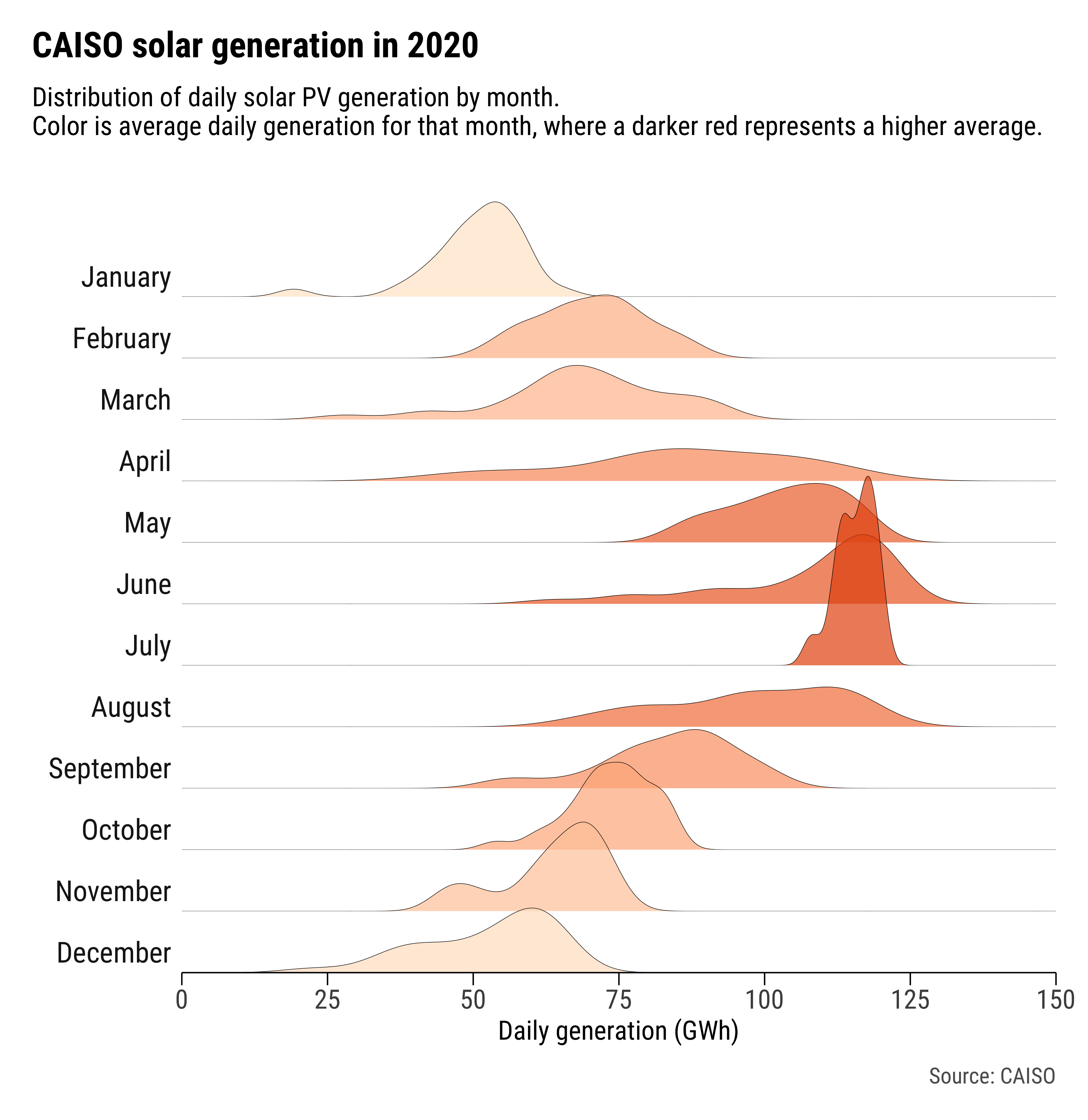
The figure below shows the result for solar PV generation. The colors correspond to the mean of daily generation values in each month. So, the darker the red color, the higher the average daily generation within that respective month.
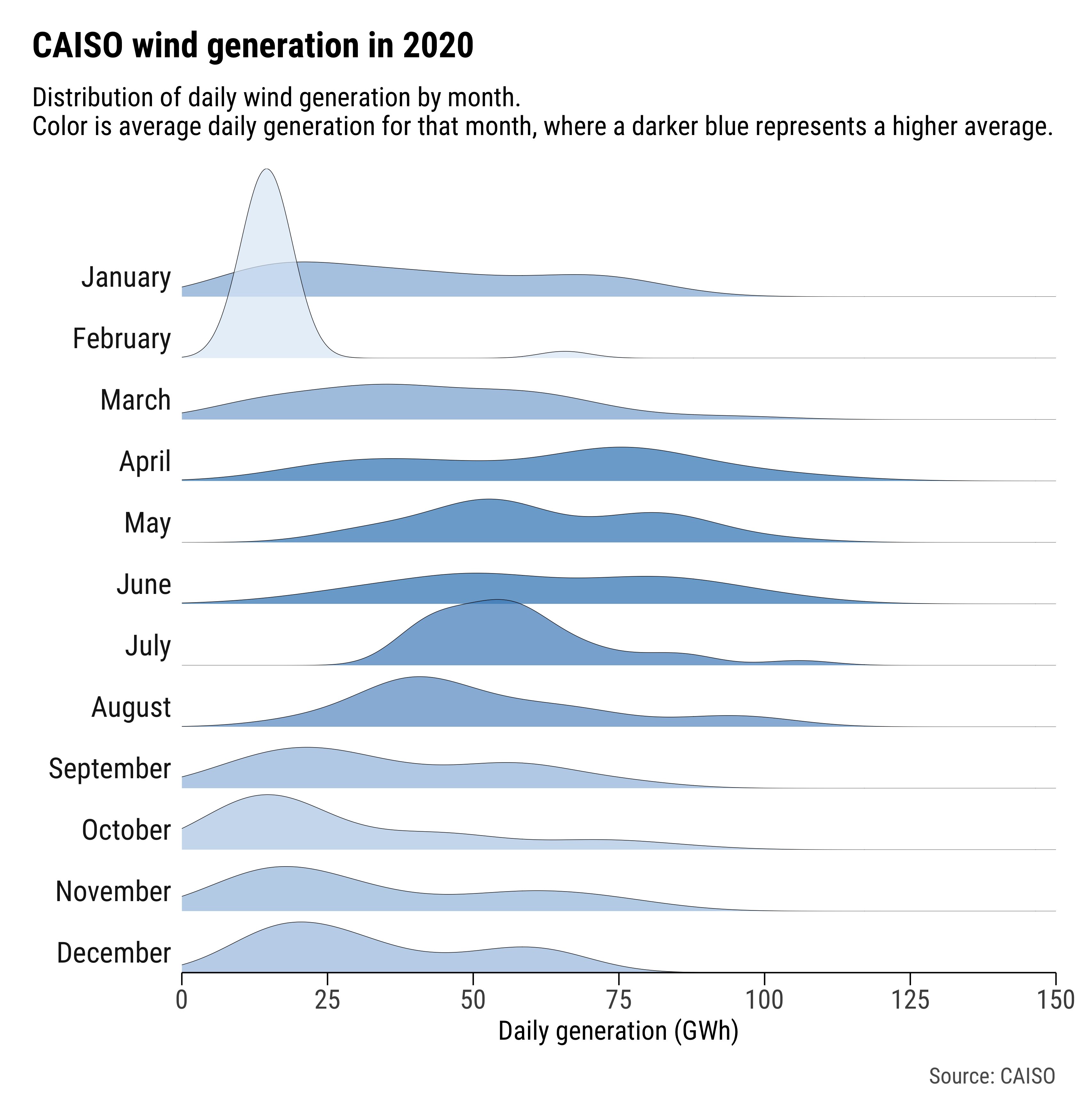
I made the same plot for wind generation in CAISO as well:
Continue reading for how I collected the data and created the plots.
The data
Accessing CAISO’s data has always intimidated me – it’s probably due to the difficulty I experience trying to navigate the OASIS platform. This weekend, I was doing a quick Google search of CAISO data and came across PyISO, a Python package that allows users to pull data from various balancing authorities. I didn’t actually install or try PyISO, but I did go through the code for their CAISO module. It appears PyISO pulls CAISO’s renewable electricity generation data from CAISO’s Daily Renewables Watch reports, which at the time I did not know about. A quick search brought me to this page. The Daily Renewables Watch reports can be accessed (and saved) as .txt files with the same URL format, with the only difference being the date. As an example, here’s a link to March 12, 2021’s report.
So, it seemed like if I wanted renewable generation data for all of 2020, I could loop through the Daily Renewables Watch report URLs for each day of the year and download the data. I created a loop that goes through each day between two specified dates, reads in the Daily Renewables Watch report for that date as a pandas dataframe, then appends the dataframe into a list of dataframes. After the loop is complete, the list of dataframes is concatenated together into a single dataframe.
To get the total daily generation from each fuel source, I simply aggregated the values of all the fuel columns to the date-level.
The complete script to do all of this can be found in this repo, under scripts > get-caiso-data.py. The script outputs two csv files: one for all of the hourly generation combined together, and one for the daily aggregation. You can specify the dates of reports you want to pull from by specifying the start_date and end_date variables. The data from January 1, 2020 to December 31, 2020 that I used for this post is already included in the repo, under the data folder.
The plots
I originally wanted to make the ridgeline plots using the Altair package in Python (like the example here). I managed to get a plot that was something along the lines of what I wanted using Altair, but I couldn’t save a high resolution version of the figure (seems to be an issue right now with altair_saver – once the issue is fixed, I’ll be excited to revisit the package).
So, I just decided to revert back to plotting in trusty ggplot2 (R). One day I will force myself to be more comfortable with using the seaborn package in Python, but Saturday, March 13, 2021 was not that day.
In terms of preparing the data for plotting, I didn’t have to do much. The only things I needed to do, that I didn’t do in the Python script, were:
- Add a column for the month
- Calculate the average daily generation for each month (for each fuel type).
Those are both easy to do in R.
As for the actual plotting, the ridgeline plots are essentially facted density plots where the y-axes have been removed, and the facets have been pushed closer together. I used the one produced by Bob Rudis on his blog as a guide (also his hrbrthemes package is one I constantly use when plotting to make my figures look nice).
The full R script to create the plots (using the aggregated daily csv file from the get-caiso-data.py script as an input) can be found in the repo, under scripts > plot-caiso-data.R.
![]() All of the scripts needed to gather the CAISO data and create the ridgeline plots are located in this Github repository. The repo also includes the CSV files and figure (PDF and PNG) files created by the scripts.
All of the scripts needed to gather the CAISO data and create the ridgeline plots are located in this Github repository. The repo also includes the CSV files and figure (PDF and PNG) files created by the scripts.